
GASSER
Brand identity, visual guidelines and digital architecture, with continuous content production, digital brand management and PR.





The Brief
Five decades in Cairo had given GASSER something no designer can manufacture: recognition the business had earned. Recognition is not the same as an identity, though, and the mark that had carried the name this far belonged to an earlier era and a smaller ambition than the one GASSER holds today.
The task was to move the identity forward without breaking the thread, keeping what still worked, questioning what no longer did, and letting the name evolve while it stayed recognisably GASSER.
Around the mark, the company needed the architecture of the brand it has become, with guidelines, corporate materials, a visual and typographic language, and a standard for how the name appears in print, in person and online.
An identity tells people who a brand is. It says very little about what the brand does, and GASSER had spent fifty years earning its reputation the old way, one customer, one repair and one handshake at a time, with almost none of it ever shown.
The brand needed a voice to match its standing. That meant a continuous body of work instead of a single campaign, covering the store, the service centre and the craft behind the counter, captured with the precision the house brings to the watches. It also needed a partner ready for the occasions that come once, if ever, such as a fiftieth anniversary or a piece of history reaching Egypt for the first time.
What We Made
We didn't redesign the mark so much as resolve it. The original lettering, the one true link to the old identity, was kept and refined, made lighter and tighter and brought into proportion with the company GASSER has become. Decades of ornament that had gathered around the name were cleared away, leaving a cleaner, sharper form that is still immediately GASSER.
Around it we built the full visual identity: brand guidelines that leave nothing to interpretation, corporate materials redrawn from scratch, and a colour and typographic language with clear rules for how the name behaves on a shopfront, a page and a screen.
The website carries the same standard online. It is three sites under one roof, with GASSER's own home alongside a dedicated Rolex world and a dedicated Tudor world, each governed by strict international rules. Hosting two of the most famous names in luxury without letting them crowd out the host took real restraint, and we keep the site under continuous management.
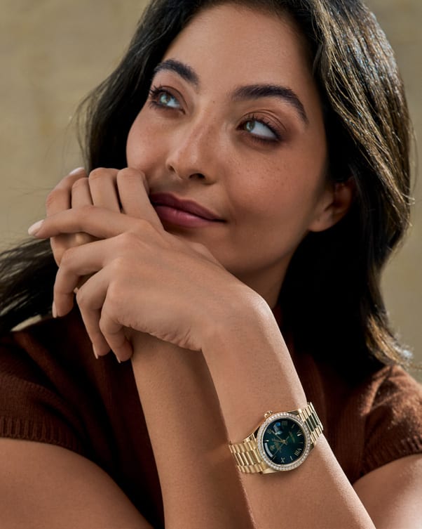
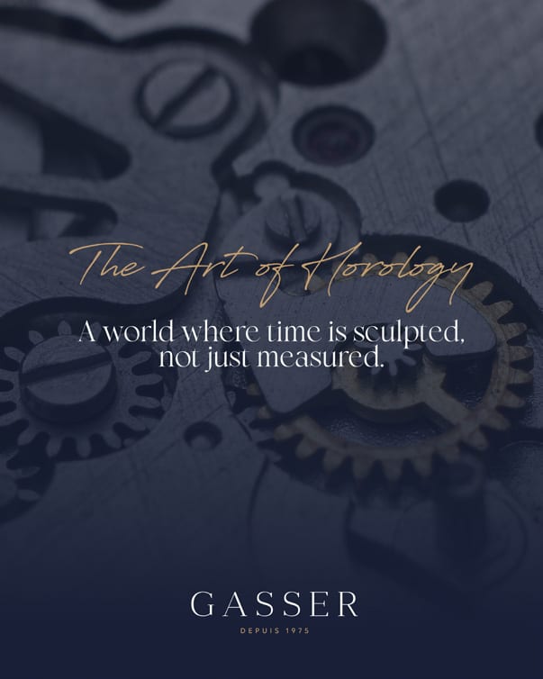
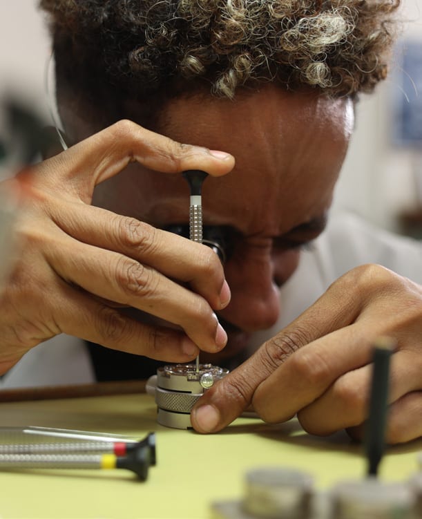
With the identity in place, production became continuous. Photography and film across the store and the service centre are shot to a single visual standard. We brought GASSER's watchmakers in front of the camera, giving customers their first look at the craft their watches pass through, and staged model campaigns that put the collection in settings worthy of it.
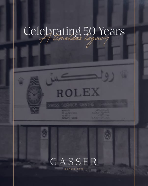
The milestones asked for more. For the fiftieth anniversary we built a heritage campaign that carried five decades of trust across all of GASSER's channels, treated with weight and without nostalgia. When the Rolex wall clock arrived, the first in Egypt and one of only a handful granted to retailers worldwide, we followed it from crate to wall in a short cinematic film. There was only ever going to be one take.
For Christmas we made a film of Cairo in 1975, produced with AI tools in a period style, with snow falling over a city that has never seen it. It travelled far beyond the campaign and brought new clients to O·ku on the strength of the film alone.
Under all of this runs the daily layer. O·ku built and manages a chatbot that answers customers in GASSER's own tone, and we handle the community management, the media buying that carried the films to millions of views, and the press coverage that followed the store, the anniversary and the clock across Egyptian media.
Fifty years of recognition, carried into the next fifty.